Friday, March 26, 2010

Thursday, March 25, 2010

IB Pictures


I like the position of Meredith in this picture, but I do not like the lighting and graininess of the photo.


I like the light in this picture of Sydney.


I decided to do a side lighting on this portrait to capture a shadow on half of her face. I basically just used brightness and contrast in Photoshop to create the finishing photo and turned it black and white.


For this portrait I used a back light to capture her beautiful long hair. I created a vignette around the portrait and turned it black and white.

Wednesday, March 10, 2010

portraits

P O R T R A I T S

For this portrait, I adjusted the exposure especially on her coat and the window in the background. I tried to reduce the intensity of the white. I did a gaussian blur on the background, and I smoothed her skin out. I chose this because of the intensity that is coming from her eyes and the clarity of the photo.


I liked this picture because of her genuine smile and the light that was reflecting in to her eyes. I had to adjust the exposure in this as well because the window was still the whitest thing in the picture. I adjusted the blacks in her sweater, and I just really like this picture.


                  - - - - - - -


Thursday, March 4, 2010

portraits!

portrait one:
I edited this one massively. Blurring the pixelations in her face, doing a lens blur on the background as well as decreasing the exposure, I added a diffuse glow filter and a warming filter to the photo. I adjusted the levels on her as well.


portrait two:
for this photo I played with the colors in photoshop adding a blue fill layer to the outside as well as adding a radial blur to add some sort of motion into the photo. I played with the exposure and contrast in photoshop. I also tried reducing the noise in the photo.
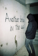

portrait three:
for this photo I played with the curves trying to get the exact colors I wanted. I also reduced the noise in this photo. I played with the levels making him lighter then the rest of the picture and I played with exposure and contrast. I like this portrait the best out of the three.


OUT TAKES!: